BoneKrusher+ 1,276 Posted August 29, 2011 i like it man. i'd change the text and placement tho i'd make Lynch a lil bigger and move it to the right overlapping the render and i'd make the Marshawn a lot smaller and use a different font and place it where it looks good with the Lynch text. but hey, i'm no good with text so you take my suggestions like a grain of salt. 1 Share this post Link to post Share on other sites
badgers 380 Posted August 29, 2011 I hate being critical but here it goes: The text doesn't fit at all. It's a nice looking font but with that background it doesn't look nice. The render is okay. It might be the background but I think it's a bit blurry/bright. I like the rising sun idea for the background, but not the motion blur you added in front of it. For the background, try making the rising sun start behind Lynch, and make it a bit bigger so you notice the center of the sun. I hate to use this example because it's not very good but notice what I did with the rising sun in the background: It's one of my earlier sigs so it's pretty poorly made, but you can somewhat notice the "rays" coming from behind Rodgers. I suggest doing that, but use a bigger size so that you can see the actual sun behind Lynch. As for the text, try to make it fit more with the whole sig. The Seahawks don't really use white at all on their jerseys, it's more darker colors. I am by no means a professional at this, just trying to help out and telling you what I think would look cool. 1 Share this post Link to post Share on other sites
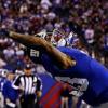
Bangy 19 Posted August 29, 2011 Thanks BK and Badgers I know about the text I am awful at finding ones that fit always have been. The other thing is that it was my 2nd sig in about 8 months so I had lost a lot of the progress I made on the other two sigs. Also on Badgers stuff go for it, that's the reason I put it up. Text is wack but I am not a person who likes text over a render but that's just me. I did have the render in the middle however it didn't look as good as it does on the right. Share this post Link to post Share on other sites
DonovanMcnabb for H.O.F 2,241 Posted August 30, 2011 Better blending b/w the text and the rest of the sig would do wander for this imo. Text looks slapped on. 1 Share this post Link to post Share on other sites